ShopDreamUp AI ArtDreamUp
Deviation Actions


Suggested Deviants


Suggested Collections


You Might Like…


Featured in Groups


Description
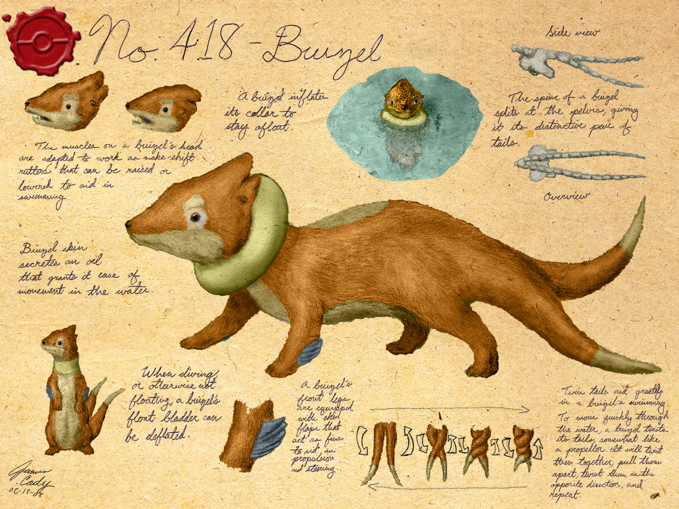
Colored work number 2!
I couldn't sleep tonight, so I went into hyperdrive, and finished this baby off.
I know, I know...people were hoping for slowbro...and I plan to get to him soon...but because he was one of my earliest works, I would like to do a bit of an overhaul on him, and actually improve the shading on the drawing, add some more notation, then rescan it, and then you will have your slowbro. I chose buizel, because he looked amazing already, and I just thought I could get him done quickly.
To be honest, I'm hoping with my recent addition of color to my gallery, that maybe my popularity will grow a bit—I don't think I'm really respected or known in the community, but I think I offer something fairly unique...surely there are less people aware of my work than Esepibe, Pokepages, Cascadegonpory, Plateman, AnnaJ, just to name a few...and even with the simple addition of octillery, I got a lot more messages in the last week than I have in the past...
On another note, Snubbull is almost completely done (I plan to finish him up later today (after I sleep)).
So yeah...leave me some love, and check back.
::snooooore::
Oh...yeah...buizel and pokémon belong to : : Nintendo and Gamefr—ZZZZzZZzzzzzZzZzzzZzzzZZzzzZZzZZZzzZzZzzzzzzzz
I couldn't sleep tonight, so I went into hyperdrive, and finished this baby off.
I know, I know...people were hoping for slowbro...and I plan to get to him soon...but because he was one of my earliest works, I would like to do a bit of an overhaul on him, and actually improve the shading on the drawing, add some more notation, then rescan it, and then you will have your slowbro. I chose buizel, because he looked amazing already, and I just thought I could get him done quickly.
To be honest, I'm hoping with my recent addition of color to my gallery, that maybe my popularity will grow a bit—I don't think I'm really respected or known in the community, but I think I offer something fairly unique...surely there are less people aware of my work than Esepibe, Pokepages, Cascadegonpory, Plateman, AnnaJ, just to name a few...and even with the simple addition of octillery, I got a lot more messages in the last week than I have in the past...
On another note, Snubbull is almost completely done (I plan to finish him up later today (after I sleep)).
So yeah...leave me some love, and check back.
::snooooore::
Oh...yeah...buizel and pokémon belong to :
Image size
1363x1022px 1.59 MB
© 2008 - 2024 GnooroopoftheGerudo
Comments61
Join the community to add your comment. Already a deviant? Log In
That looks amazing! Buizel is my favourite Pokémon so glad it gets this awesome art! Good job! ")